

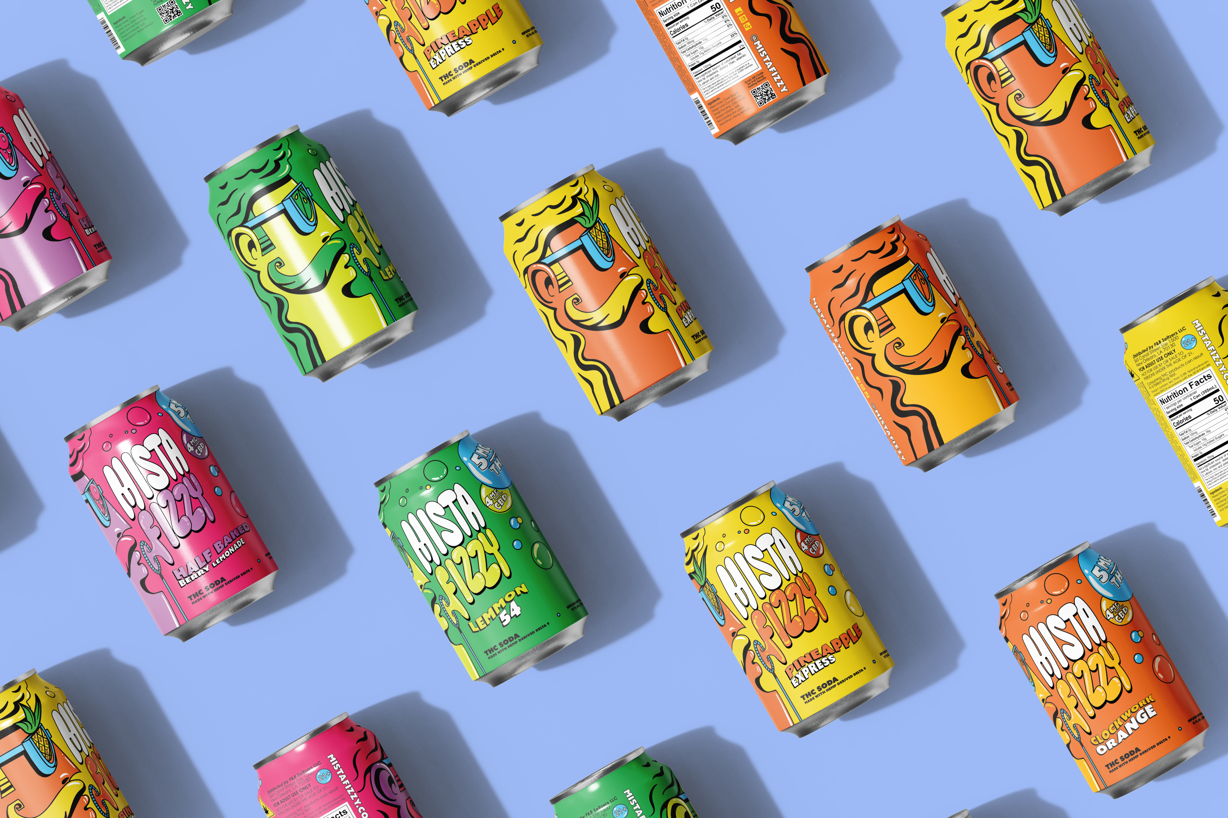
Mista Fizzy already had a lot of personality.
The goal was never to replace any of that.
The real challenge was clarity and systems; making the brand easier to use and more accessible. A wand blowing fun brand voice bubbles that carried over visually as well.
The logo needed clarity without losing its charm. Some of the letterforms became tight or difficult to read at smaller sizes.
Also, a consistent system for packaging, photography, illustration and digital spaces was essential. The growing flavor family needed just enough rules to expand without becoming too buttoned up.
Credit
Creative direction and design by PGCreates in partnership with Brand Society. Brand Society reviewed and approved each stage of the evolution. Copywriting partner Mike Hartnett
MISTA FIZZY
Partnered on
- Brand Evolution
- Creative Direction
- Wordmark Refinement
- Responsive Logo System
- Packaging Evolution
- Brand Guidelines
- Verbal Identity
- Art Direction
- Campaign Applications
- Website Direction
- Website Design
- Copywriting
Industry
Consumer Packaged Goods

Unbuttoned up
The assignment was not to make Mista Fizzy more polished but to blow an even bigger bubble.
The fun and humor needed to stay. What changed was the structure underneath it.
The goal was more clarity. More consistency. More flexibility. Still Fizzy, just easier to see and easier to use.
Keep the bubbles. Fix the friction.
The original logo already had a lot going for it. It was recognizable. It felt handmade.
It needed a few areas refined to reach peak clarity.
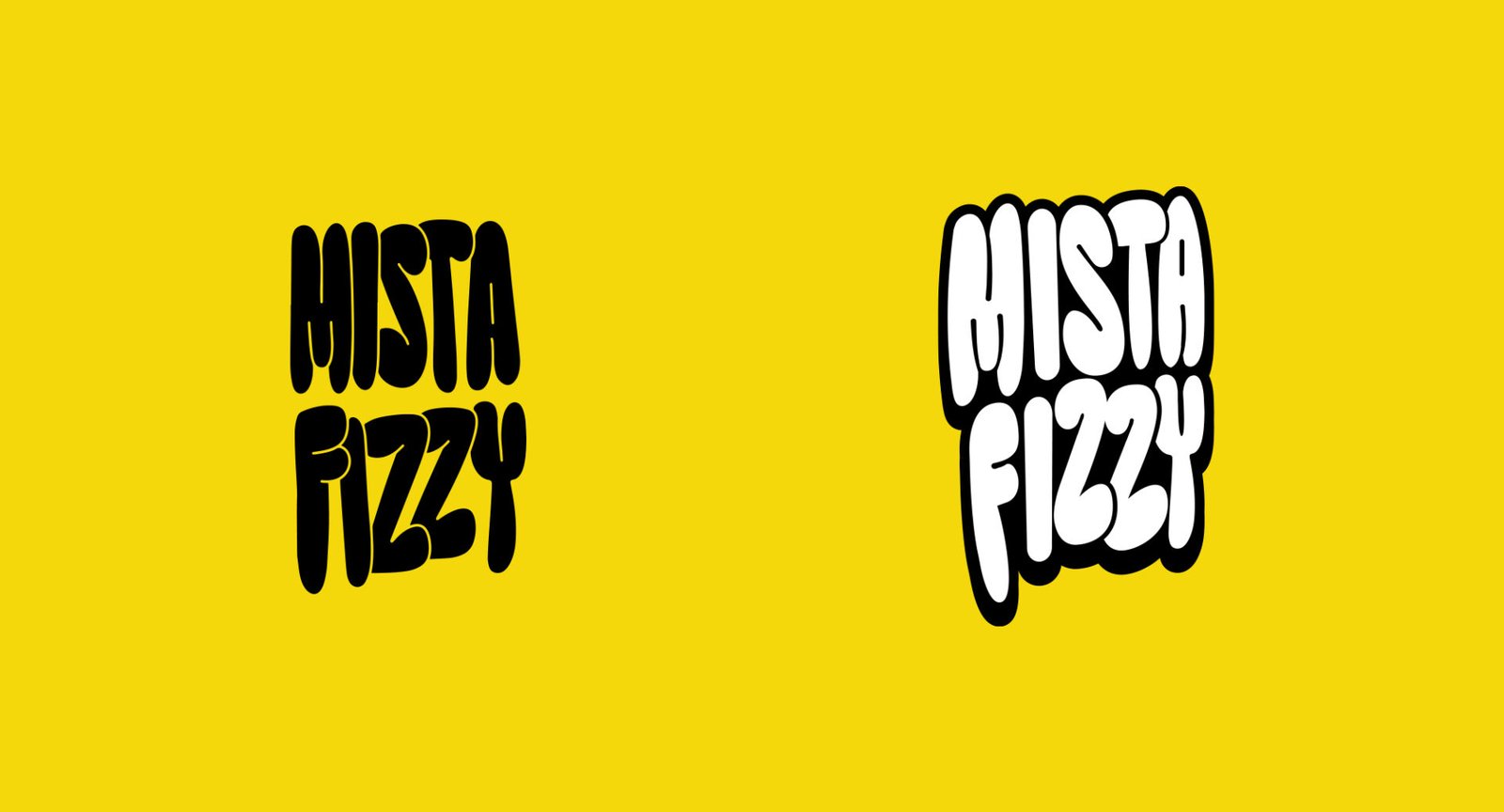
Some letters crowded each other. Some internal spaces closed up. The M connection needed help. The F and I became hard to separate. The lowercase ‘i’ needed a better angle. The last Z needed more room to finish the word.
So we evolved the logo in small steps.
Internal spaces opened. Letter connections improved. Angles shifted. The final Z stretched out. The whole thing started breathing again.
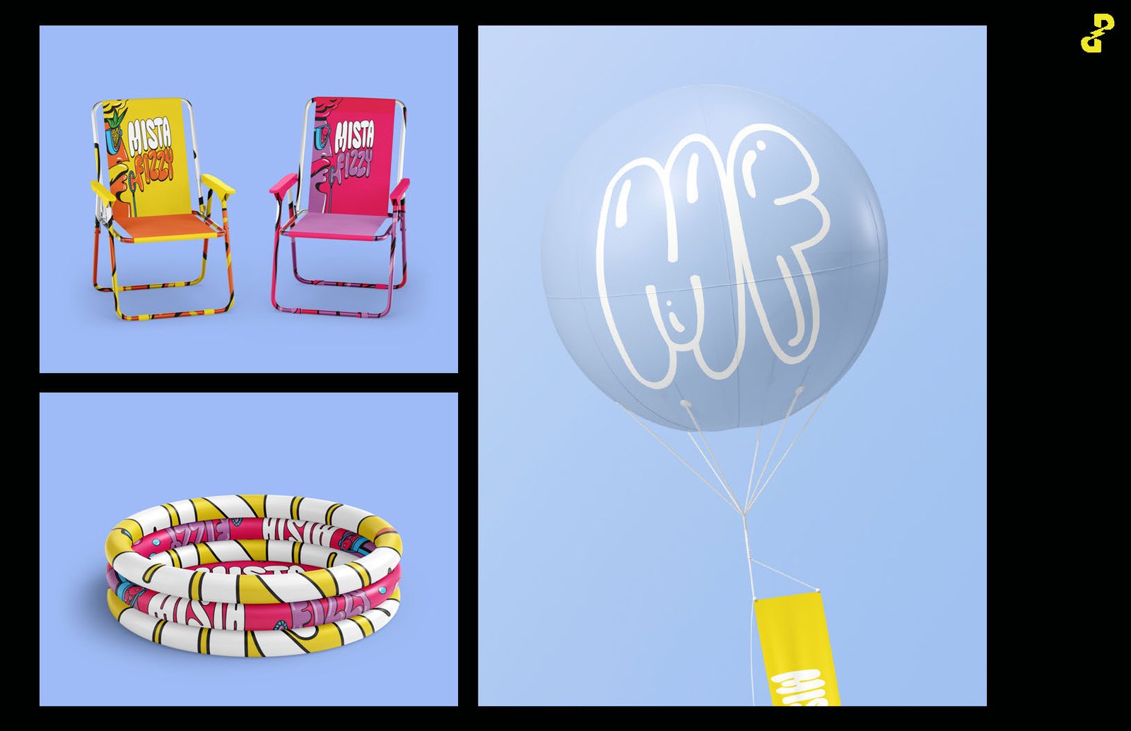
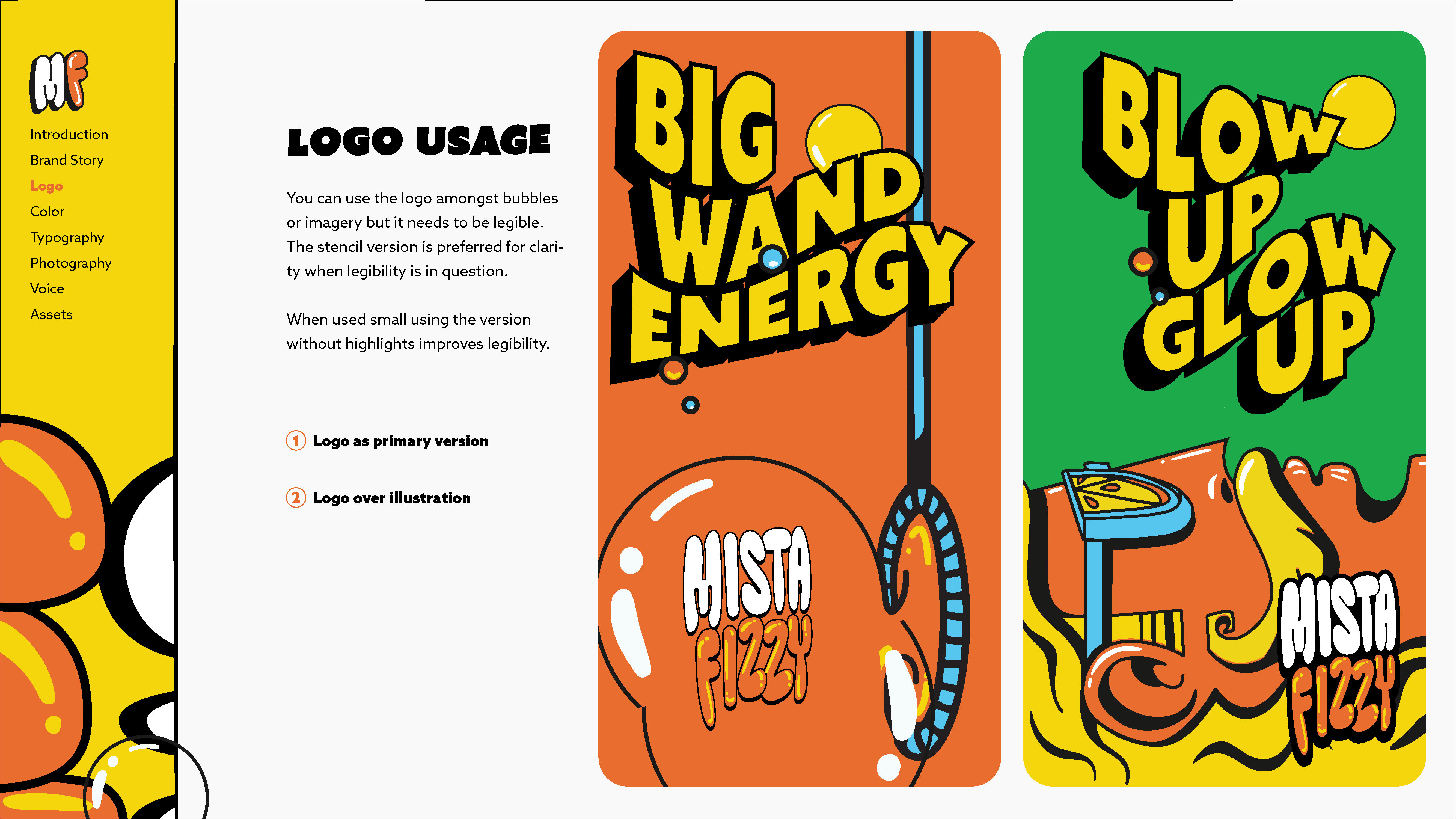
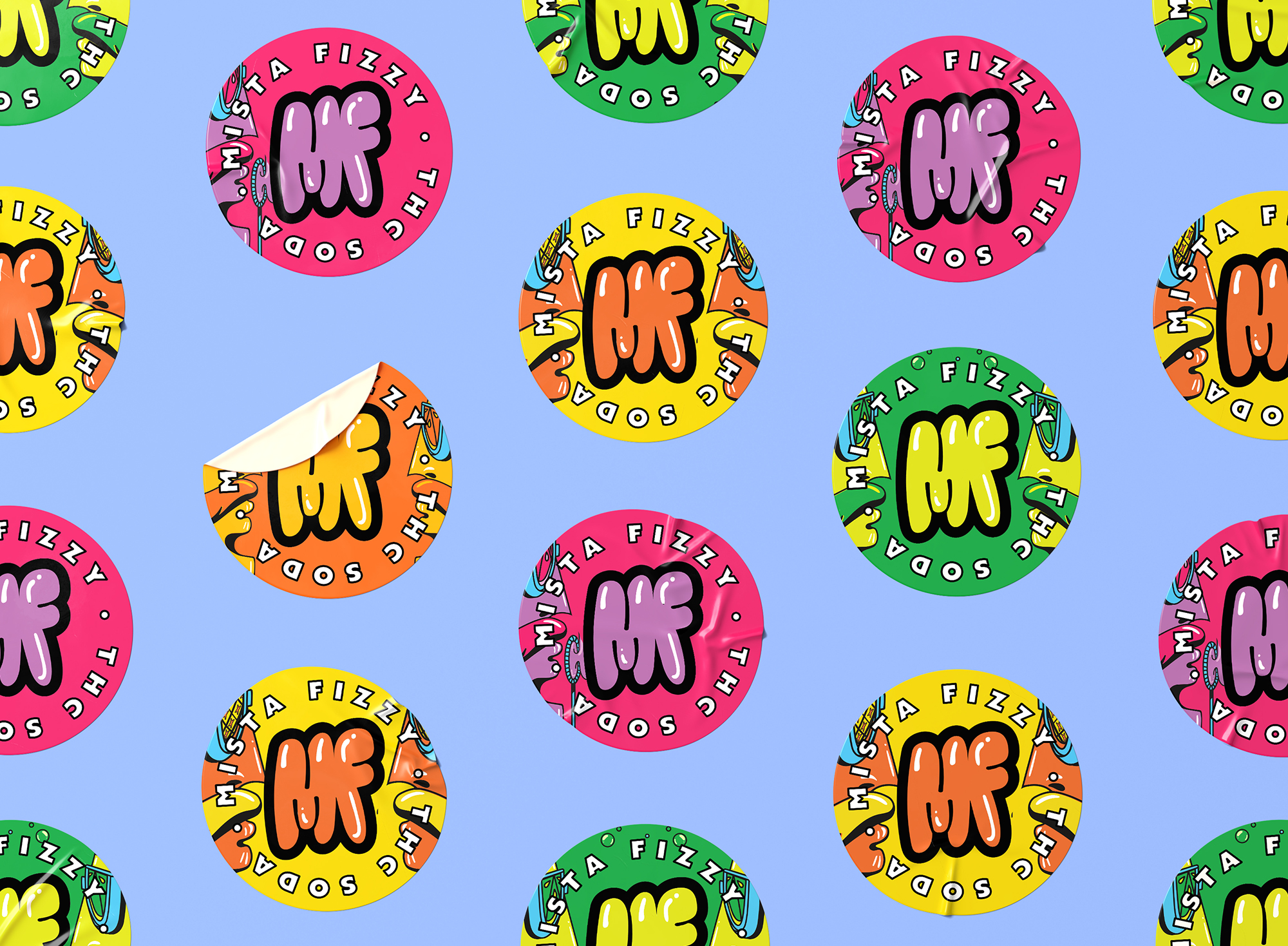
The evolved system includes stacked and horizontal wordmarks along with solid, outline and stencil versions. A simplified MF icon keeps the brand recognizable in small spaces like social profiles, favicons and motion.
It still looked like Mista Fizzy… but now the bubbles could be seen from a distance and in more places.
Built to keep on bubblin’
The logo evolution grew into a much bigger brand toolkit.
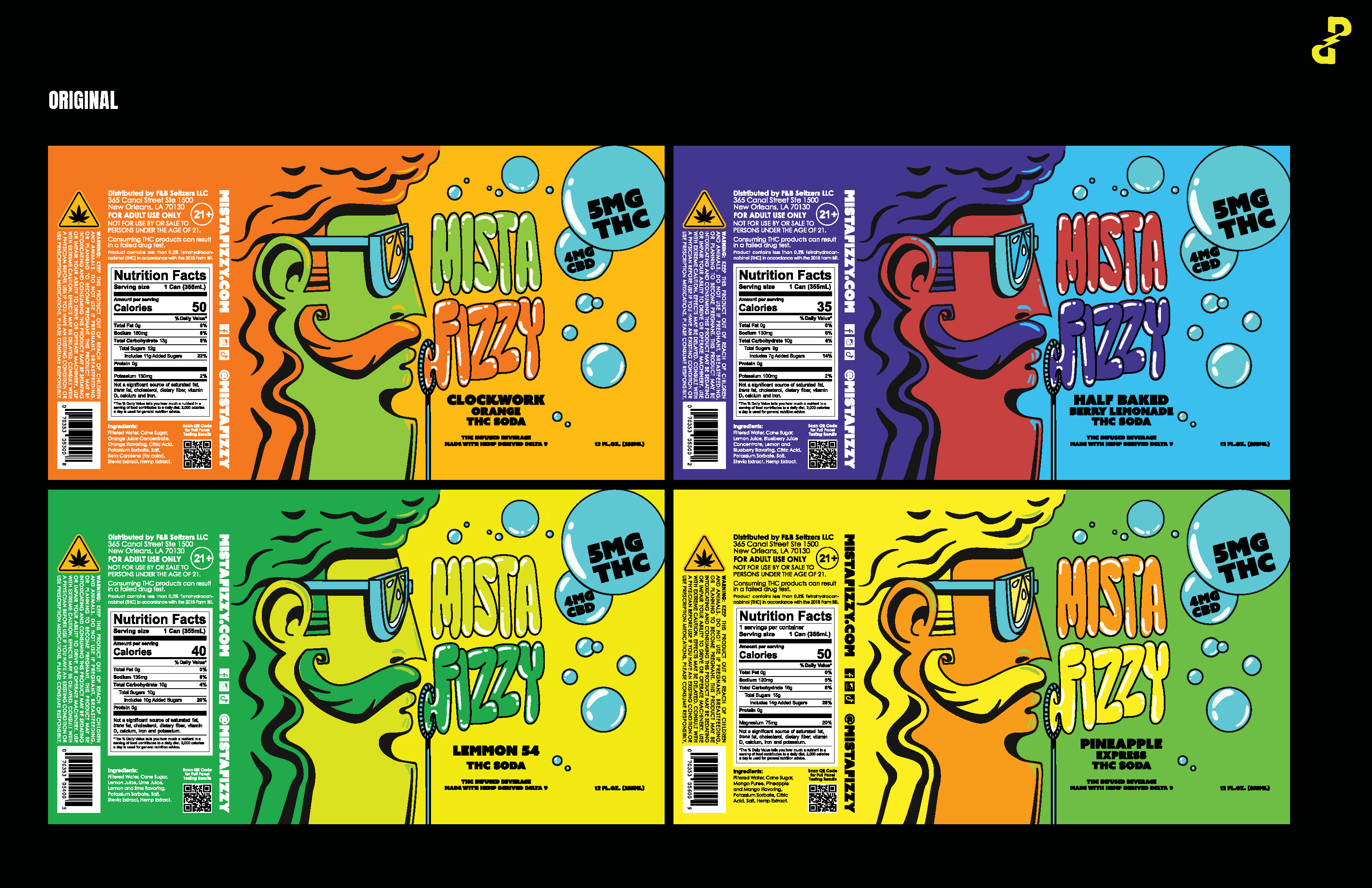
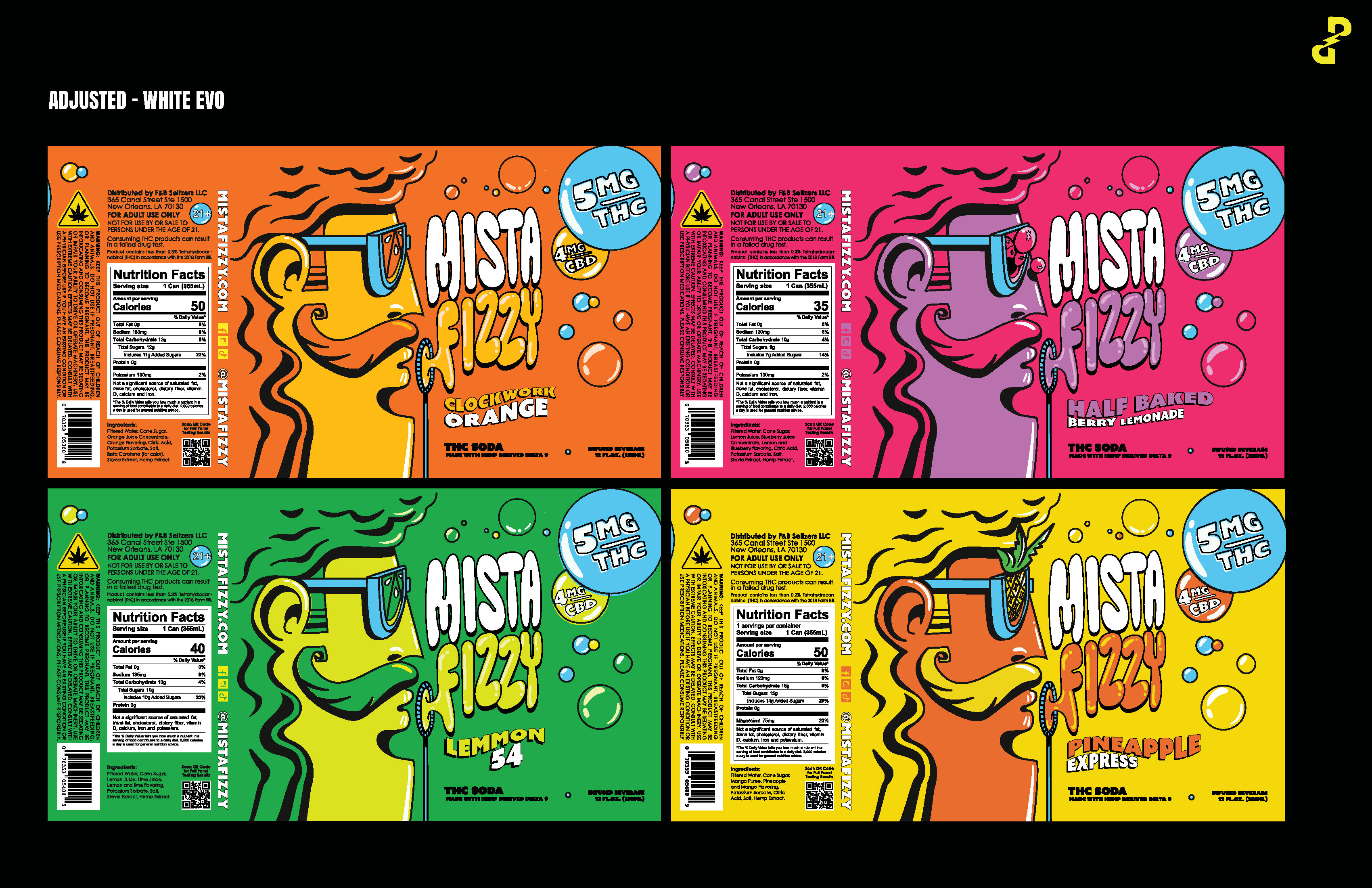
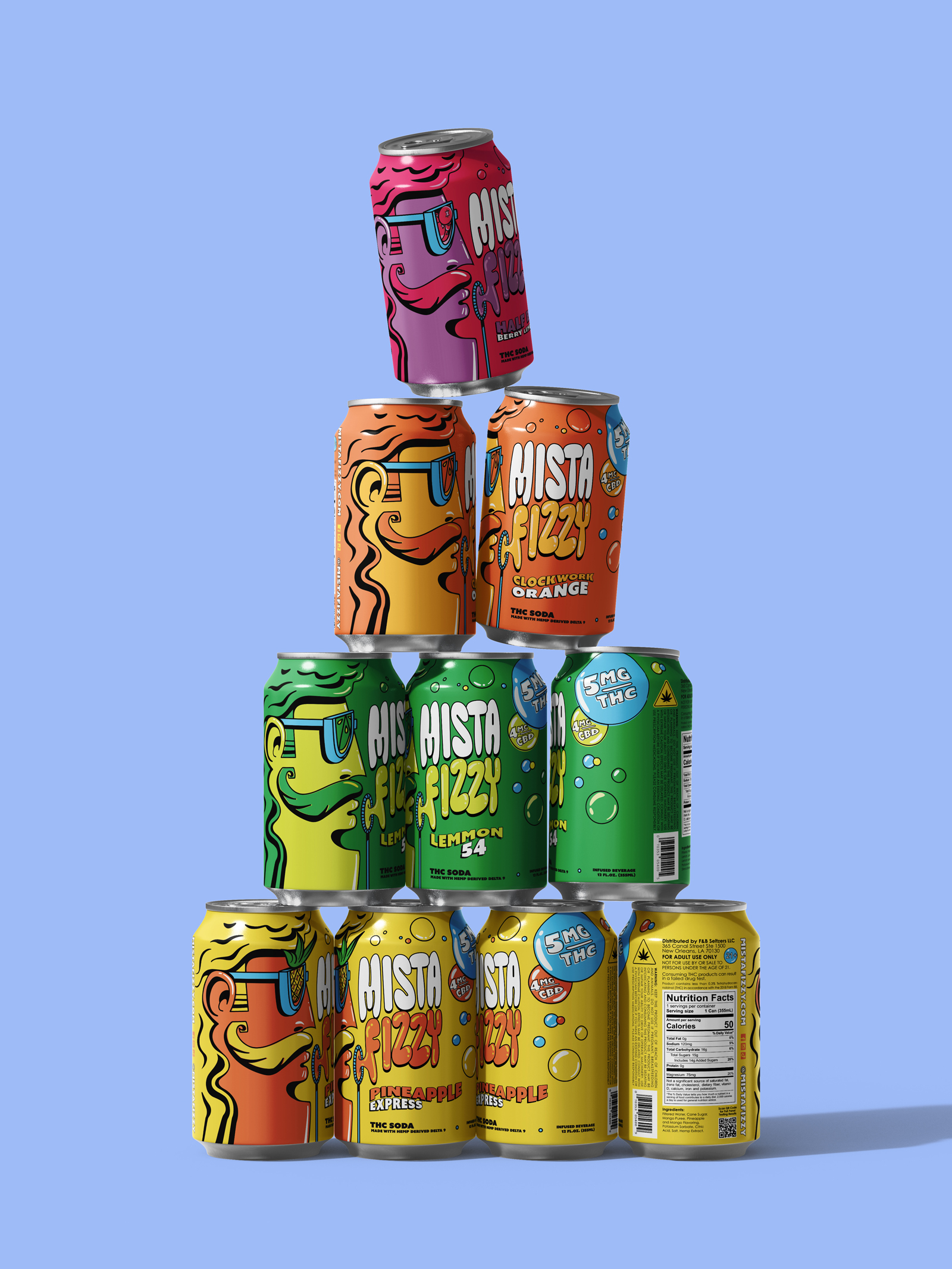
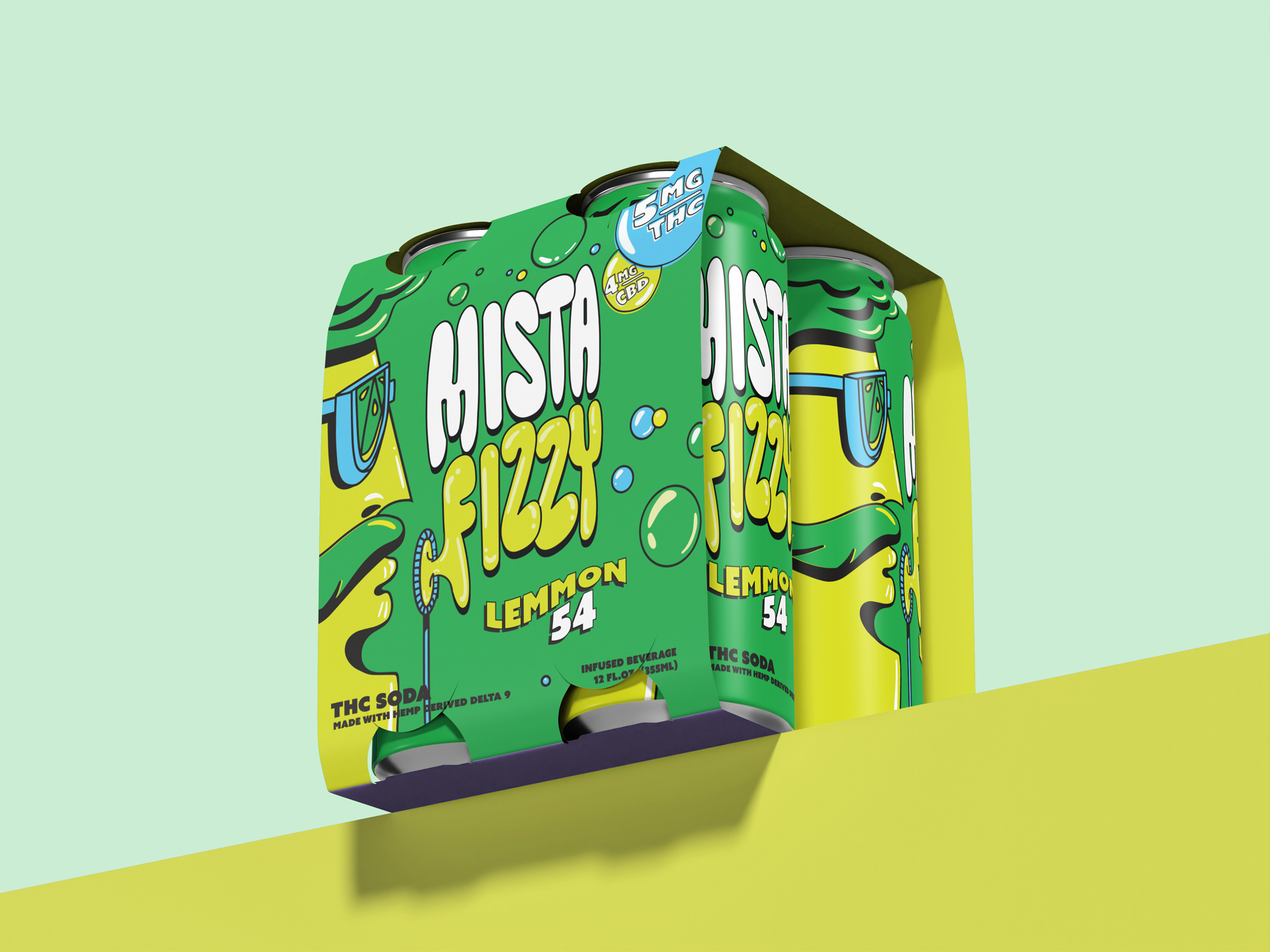
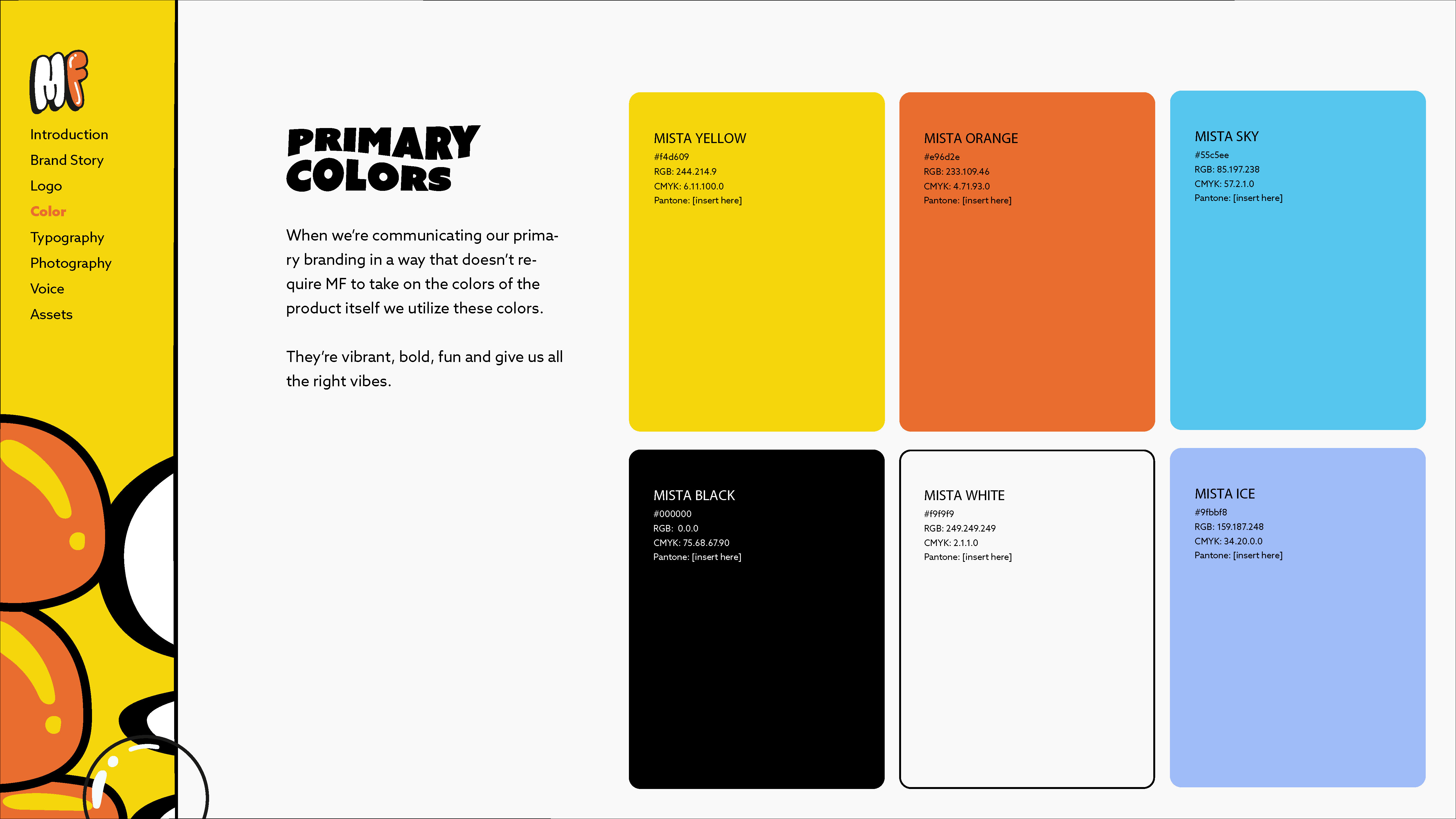
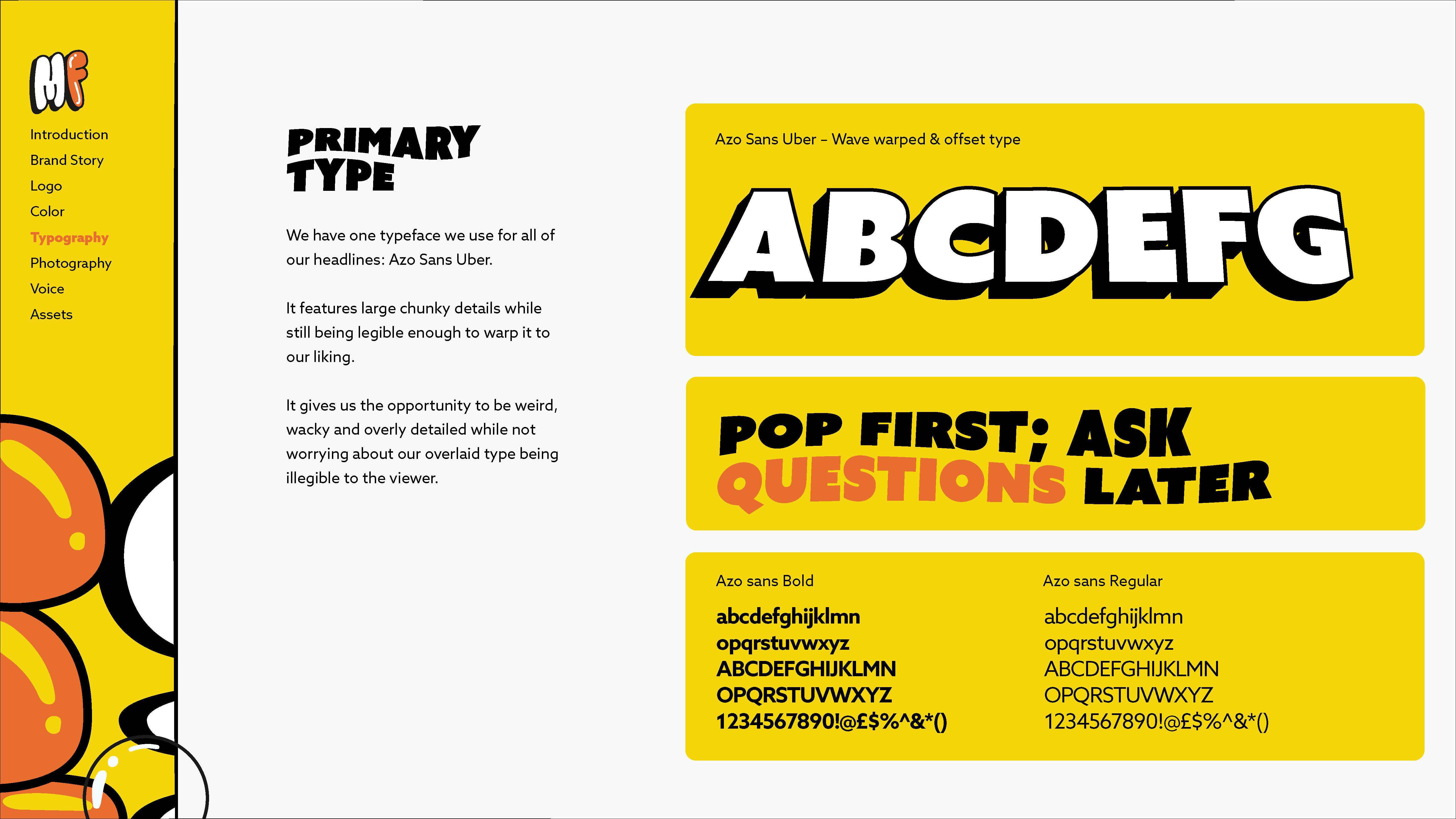
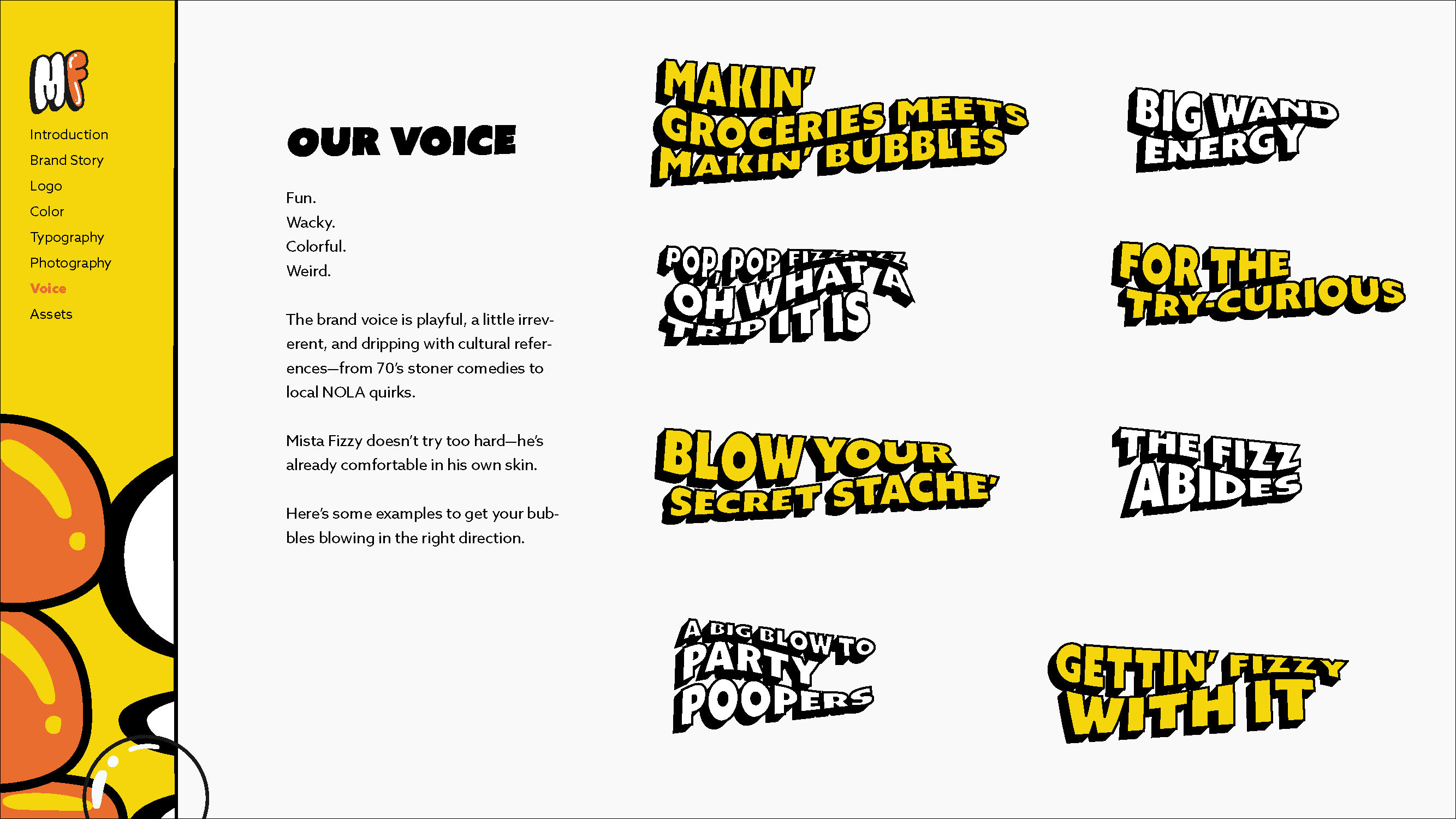
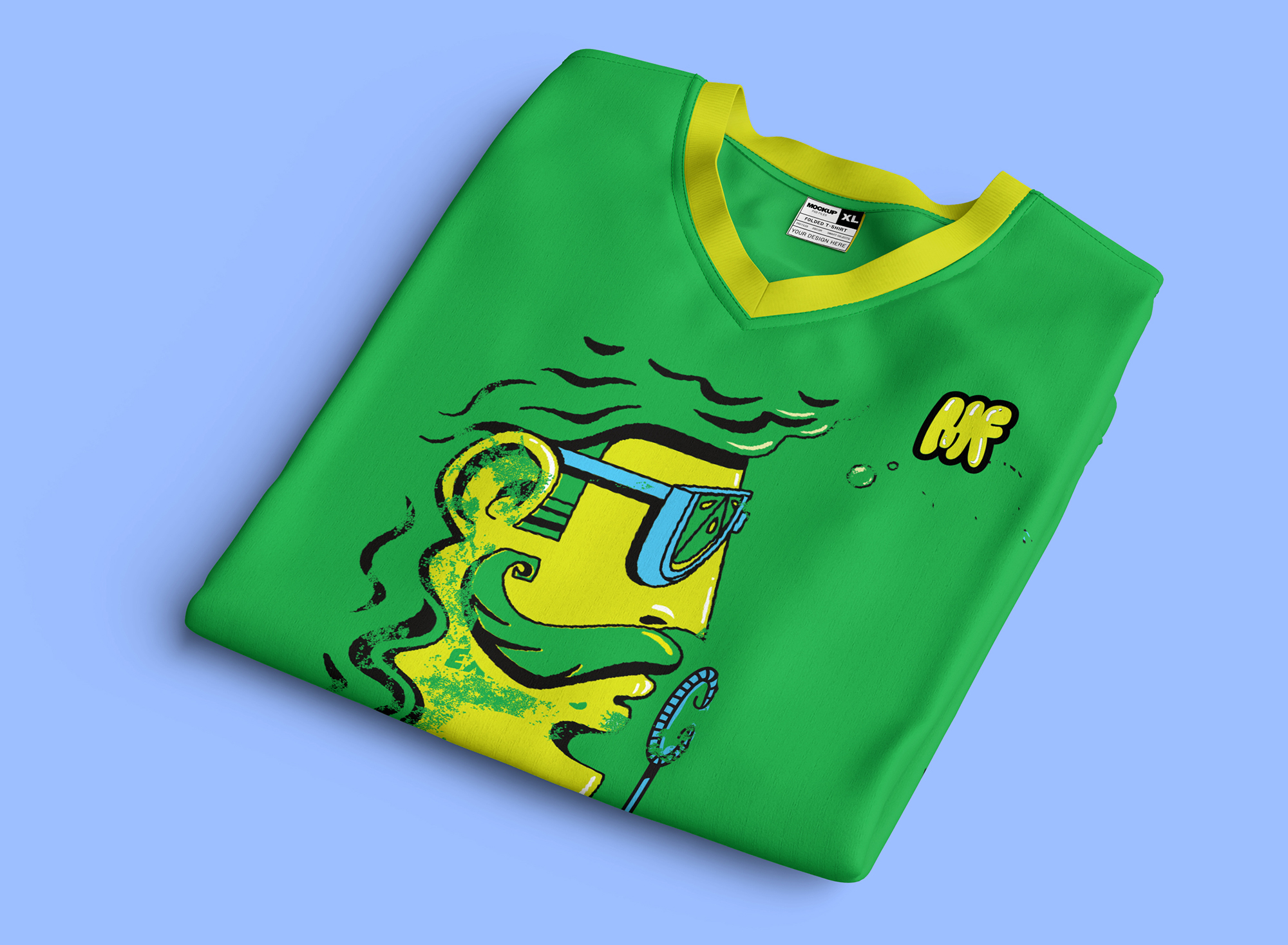
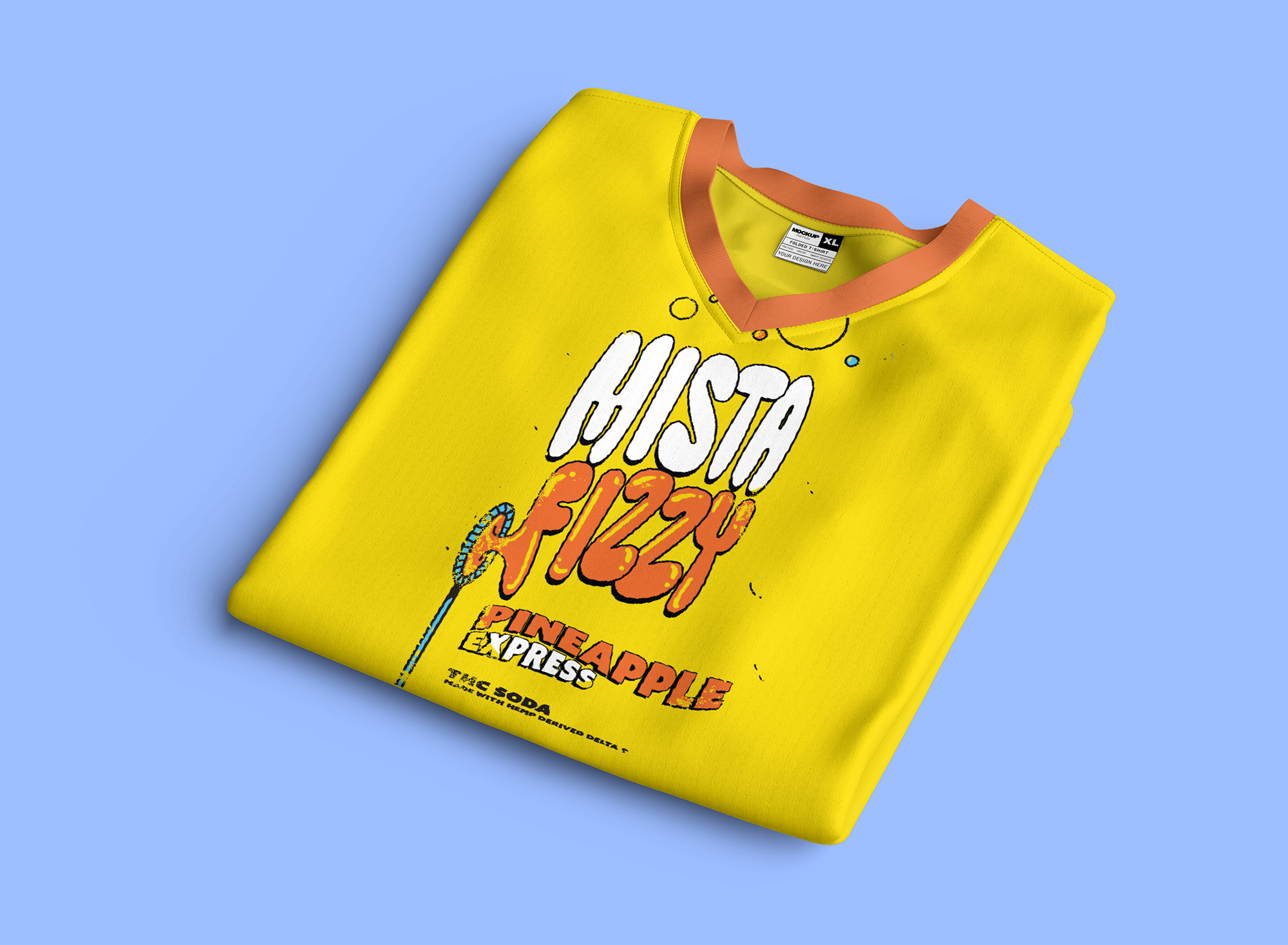
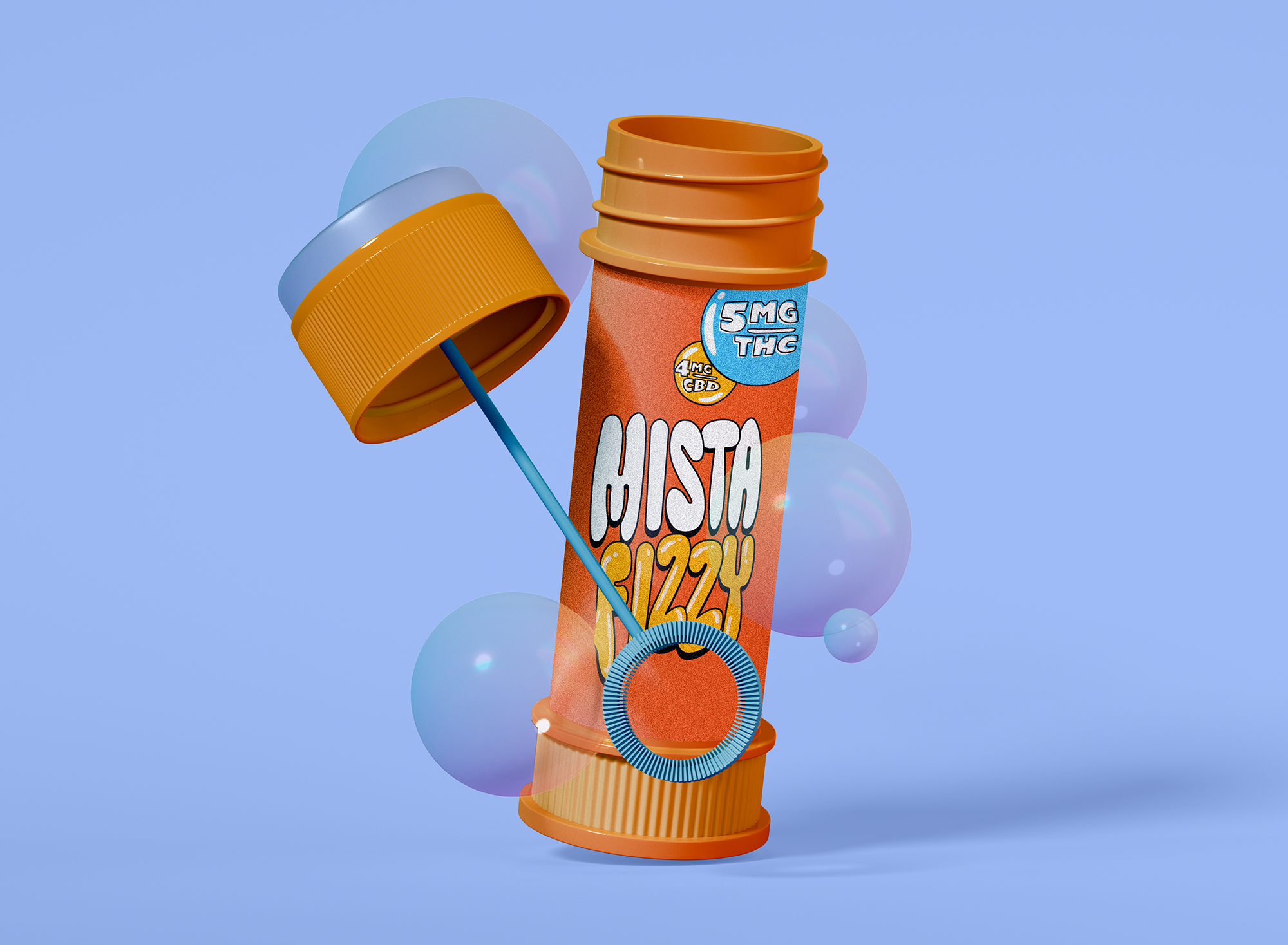
Packaging studies created stronger consistency across flavors. The brand guide established rules for color, typography, photography, voice and logo use. Website direction, campaign lines and consumer applications showed how the same weird little world could keep expanding without losing itself.
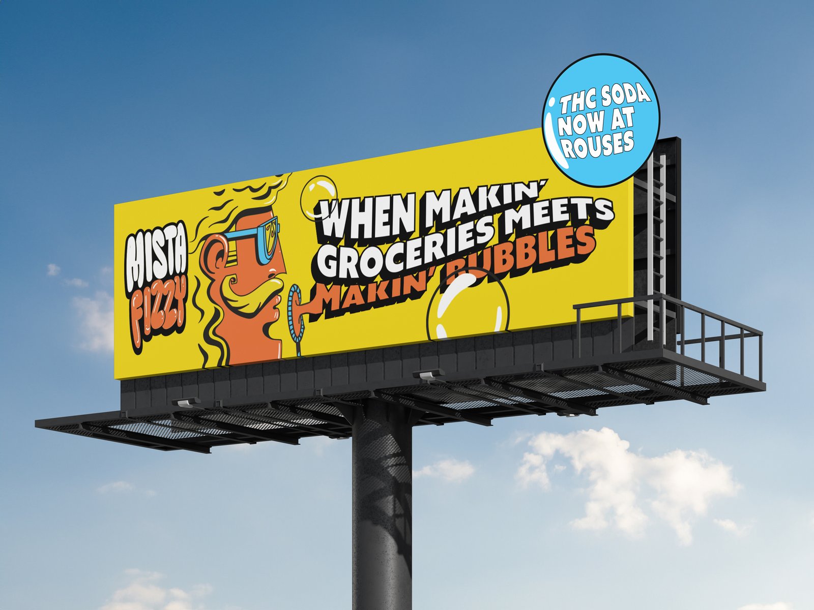
Mista Fizzy could now move from a can to a billboard. From a lawn chair to a social icon. From Lawn-Chair Luxury to The Fizz Abides.
Mista Fizzy’s playground just got a whole lot bigger.
Project Outcome
An evolution that ‘blows’
Mista Fizzy came out clearer and more flexible.
The logo reads better. The system works at more sizes. Packaging has become more cohesive. The brand has more tools for digital, campaign and retail use.
The brand didn’t lose any color, character or quirk.
An ice-cold welcome to the world of fizz
The finished system gave Brand Society a practical base for future packaging, campaigns, content and digital experiences.
Responsive logos. A compact icon. Voice and copy direction. Photography guidance. Color rules. Application examples. A full set of guidelines.
What started as a logo evolution became a much bigger brand toolkit.
“Exactly what we needed. Great to work with.”
JDBrand Society